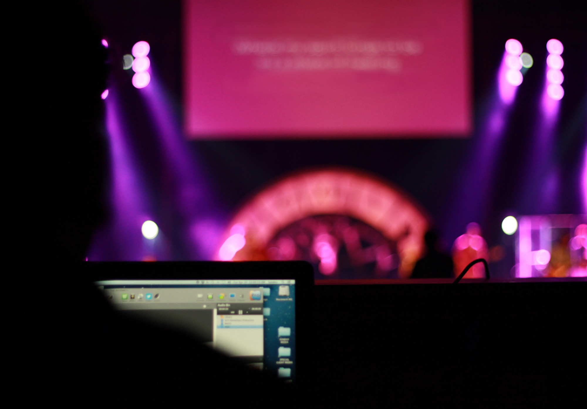
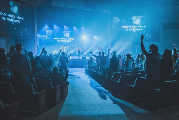
Projecting song lyrics on Sundays was really my first love in church media. It plays into what I consider one of the most essential responsibilities of the local church – going above and beyond to make it easy for people to get involved. When you provide lyrics to your worship songs, you put everyone in your auditorium on an equal playing field. Whether they’re in a pew every Sunday or haven’t darkened the doorway of a church in years, providing lyrics makes it easy for everyone to participate.
Because so many eyes will be focused on them throughout your service, it’s important to make sure that your lyric slides are organized and done correctly. Here are six quick changes that will keep your slides looking good:
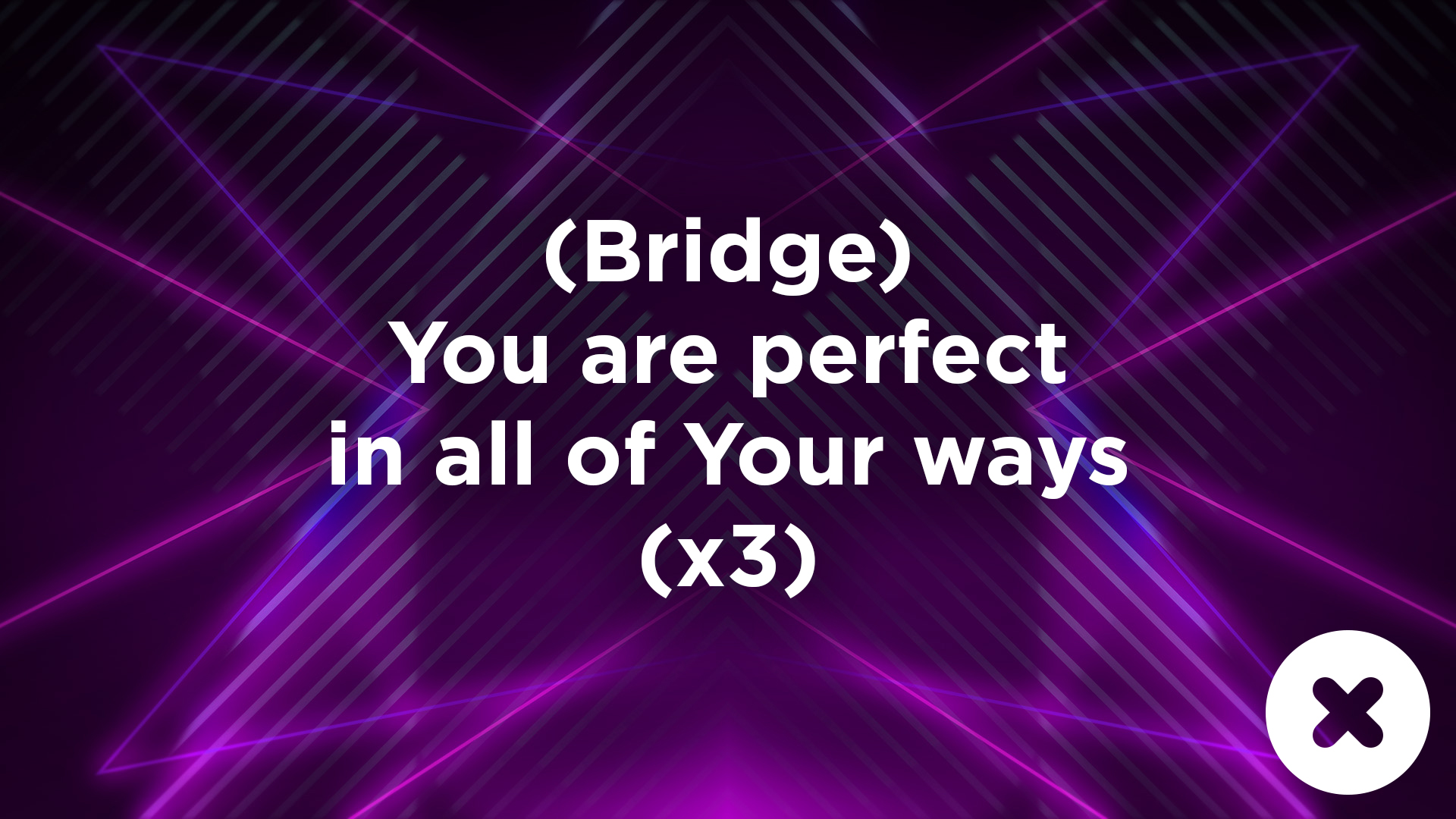
1. Remove Labels and Instructions
Simplicity goes a long way when your congregation is reading lyrics during worship. There’s no need for labelling each part of the song (bridge, chorus, etc.) or even providing instructions (repeat, x2, etc.). Instead, just provide the lyrics exactly as they’re to be sung.

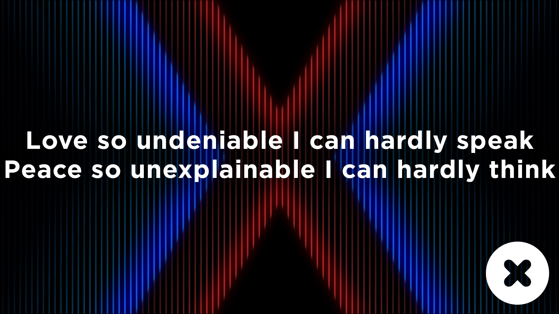
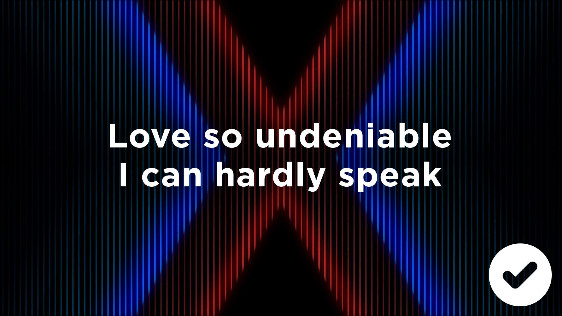
2. Avoid Getting Too Close To The Edges
This is a mistake that’s often made with good intentions. It can be tempting to squeeze in those few extra words, but crowding the lyrics on your slide gets messy fast. Split your lyrics into two slides or use a smaller font size to maintain your professional look.
3. Use No More Than 1-3 Lines Per Slide
The quickest way to add confusion and distraction to your lyric slides is by having too many lines on the screen. Keeping your slides to a 1-3 line max makes it easier for your congregation to follow along and for new singers to jump in at any given time.
4. Ditch Commas or Periods At The Ends
These are lyrics, not sentences that require perfect punctuation. For a much cleaner look, delete the commas and periods on the end of lines. The line-break is more than enough for your congregation to recognize that there is a separation.

5. Avoid Repeating Lines
Why have two lines if one will suffice? If a song has a repeating line, cut one of them from your slide and show off that background! Not only does it look a lot cleaner, but it portrays that the song is really easy to jump into for those just coming in.

6. Emphasize Key Phrases With Larger Text
This change isn’t about fixing a problem as much as it’s taking your slides to the next level. During some of the most powerful parts of the song, try increasing the font size on some of the key phrases. This often comes during the chorus or bridge. (Tip: Less is more. This works best on slides with short phrases.)


Font Used: Gotham Bold
Backgrounds Used: CMG Monthly Mega Pack (February 2016)
Do you have any other changes that you’d add to the list?
Let us know by leaving a comment below!


Ah… this site is so refreshing. Good tips. Thanks!
Comments like this are so refreshing. :)
I am new to this media thing and have so much to learn. Love this site and am looking forward to growing our media. Thank you SO MUCH for your fresh and modern ideas… we need all the help we can get!!! lol
I totally second this notion!
I use many of these techniques already, but I love seeing them in one place as a helpful resource. Thank you for the great advice!
Thanks so much, Randy! Your feedback is really valuable to me.
I agree. I see that I’m on the right path. Thanks Kendall
Easy to follow and simple tips that make a huge difference. Thanks for providing this quality content!
Thanks for this comment! It’s encouraging to get feedback like this. :)
Hey Kendall,
Let me first say how excited I am that you are back in business on The Creative Pastor. My worship pastor and I love your articles and have gleaned so many helpful tips from your site!
I wanted to see if you had any tips, or if you could maybe do an article on lyrics over IMAG. We use IMAG for our entire service including worship, so our lyric format is bottom third. We have a good system in place, but I am always happy to receive helpful information! Thanks so much!
Hey, Andrea! Our church is about to add IMAG at Easter, so I’ve been thinking about this a lot. I plan to use this same system – 1-2 lines tops.
Another thing I like to do is eliminate repeating slides (like when a lyric is repeated).
I love coming and reading the articles every week. Really helpful without being pretentious.
Do you guys use a stage display (confidence monitor)? I keep those repeating slides so they show up to the worship team as their “next slide.”
Does that make sense?
Yes! We do the same and have been curious how others go about that.
PS how do I get a cool picture like you guys?! Haha
The picture comes from having an account on WordPress.com I think. I’m looking at a new comment system that will bring in Facebook photos.
Every person connected with a church’s media ministry should be given your information and tips to read. I am just a lowly computer/slide volunteer but I have learned so much from you – learning that makes me wish I had the opportunity to make changes in my church’s media output. Thanks so much, and keep on ….
We all start somewhere! :)
Thanks for being faithful in your current position. Hopefully opportunity for promotion will follow!
Thanks again for another great resource! I also am doing most of these things already but it’s great to be reminded of them! Question: Where do you (anyone reading this article) find moving backgrounds? What backgrounds have you found helpful, engaging, creative for your songs/services? I’m looking for some new backgrounds. Thanks!
It’s hard to beat the $10 monthly mega pack from CMG. I’ve used many companies over the years, but I’ve been so impressed with the quality and price with the mega pack that it’s hard to use anything else.
Great tips as always! I had been following most of these from posts you had done before. But there were a few new ones. Thanks for all the great work, love that you are back!
Great work, Justin! The big change that I’m noticing in lyric slides across more and more church is LESS lyrics per slide. I remember when 4 lines of text was normal to me. Now it makes me cringe a little. Know what I mean?
Made me happy that I already do these things! Love your site, it’s always my go to when I have questions or need some guidance.
That’s when you give yourself a good pat on the back, my friend! :)
Excellent advice! I disagree with you on #4 (punctuation) but I understand where you are coming from. Love receiving these helpful emails from “The Creative Pastor.” Keep ’em coming!
I love a good conversation! How do you handle punctuation on your slides and why?
I was wondering if anyone else thought this. I’ll admit I don’t go out of my way to add punctuation to songs. But I do appreciate lyrics that have them correctly applied, and I leave them in there. This is mainly because I don’t believe we’re simply reciting words. We’re reciting meaning. And punctuation was invented to direct meaning. There are plenty of memes and bad church signs to support this idea :)
https://cdn1.lockerdome.com/uploads/4261b509d3e27950f856b5a12320b2e0d2ac2f68fec86b6f855546fc9eac200e_large
https://s-media-cache-ak0.pinimg.com/236x/bd/07/1c/bd071c786a1041a582500f30863926bf.jpg
Hard to argue with those church signs! :)
I know that our church has used full punctuation in the past. I think some of it depends on the content. I think a lot of the older hymns benefit from the punctuation as it emphasizes the text, and sometimes makes it more readable. We are in the process of removing the punctuation from our slides, and I think they lose a lot of their punch, especially words followed with an exclamation point! I think Praise Him! is much better than Praise Him.
I could use tips and tricks on Bible References, scriptures and quotes added to the sermon.
Some weeks….i’m not sure what I should be doing….:(
Kendall,
For me, it’s really more about my philosophy of excellence in worship than anything else. I mean, we work for hours to be excellent in our music, preaching, teaching, A/V, and so forth. We’ll never achieve perfection, but we can (and should) strive for excellence. And although it may seem very minor, in my opinion, part of excellence in worship is using correct punctuation for anything shown on the screen(s). Lyrics are poetry, and periods and commas do matter (even though CCLI leaves pretty much ALL punctuation out of their lyrics).
Do I think that not using punctuation marks in lyrics is the “unpardonable sin?” Of course not, nor is it my mission in life or ministry to be a champion for this. But, it does matter to me.
Having said that … I completely understand where you are coming from and I do agree with you that not using punctuation marks definitely gives a “cleaner” look to the slides.
Just my .02¢ worth,
Alan
I find myself editing the punctuation on almost every song – mainly for the purpose of making sure that what goes up on the screen makes sense and it’s obvious which phrases go together. I will leave/add mid-line commas to separate phrases, thoughts and ambiguity, but I omit periods and commas at the end of a line, as they are the semantic equivalent of grinding to a halt. In the context of worship, traditional or contemporary, a complete stop is not what we’re going for. (I have been known to leave it in for hymns, as it makes more sense with the musical structure.)
Lyrics on screen are a secondary worship leader – they are not designed to be read, but to be glanced at so that the individual can find their place and be included in the corporate worship time. We can borrow ideas from newspaper headlines (form, not content!) as an example of something designed to be read as quickly as possible.
Great insight, James! I like this!
Thanks! I’ve been doing a couple of these already, but there’s a couple that I will implement right away! Thanks!
Glad to help, Barry!
Hi Kendall !
Love your articles and I’m so happy that you started writing again on your site. I wish more of my french colleagues here in Quebec Canada could understand English better. I’ll try to disseminate your wisdom in French to all who are willing to receive it. ; )
I had a question about the topic you posted on.
What should we do when there are songs with two parts like that very well known song ” You are holy (Prince of Peace)” where the girls and guys both have different lyrics to sing at the same? Same thing with songs that are sung as a canon.
We are using PCO Projector for the projection and the following is how we have it set up, but I find the style of it “unclean”, not in the sense of dirty, but more like sloppy. How would you do it?
Chorus
(Hommes)……………(Femmes)
Je veux chanter…..Tu es roi des rois
Et louer……….Et prince de paix
Le roi grand…..Tu es Dieu puissant
Et glorieux…..Seigneur des seigneurs
(Hommes)……………(Femmes)
Je veux t’aimer…..Tu es mon rocher
T’adorer……….Et ma forteresse
Me prosterner…..Tu es mon soutien
Devant ta majesté…..Tu es ma sagesse
This is a great question, but I’m very far removed from this kind of song in worship. The only idea that I have is possible doing something like the example below…or doing two columns and getting rid of your dots between.
(Hommes)
Je veux chanter
Et louer
Le roi grand
Et glorieux
(Femmes)
Tu es roi des rois
Et prince de paix
Tu es Dieu puissant
Seigneur des seigneurs
This is the ultimate contemporary example of a song that “breaks” all of our nice clean layouts as it’s not easy.
Incidentally, because of the complexity of the song, if I were a worship pastor (I’m not!), I’d be asking if it’s appropriate for a congregation made up of people of all different musical abilities. I really like this particular song, but I wouldn’t choose it for most congregations!
When formatting the song, I would follow the rule in the article about removing labels as they are made obvious by context (I.e. Which part is for men and for women). Free of that, I would left-alight the men’s part and right align the women’s, keeping two simultaneous phrases on screen at once (because of the pace of this song) or just one if you need lower thirds. It’s still tricky for the operator to keep up with, especially if they get lost, but it declutters the screen and relies on context for the things that are removed.
Good thoughts here!
Excellent advise. We already use some of these, but we need to do some house cleaning on some of our slides with period and comas. Also, this is fun for me, because this is one of the rare instances I have run across where a stock photo of mine was used. A friend of mine pointed it out. So now I get a glimpse at that and a great resource to follow. Thanks.
Great picture, Richard! I love getting photos from Lightstock.
Another great article. Your. Site is so useful. Just a couple of comments. Firstly backgrounds are important especially for the visually impaired. I am writing this sitting across from a congregation who suffered a stroke that affected his sight. Unless the background is plain he is lost.
Also we have one font size, 40pt, and stick with it for the same reason.
Every church has different needs and we’re called to care for those needs. Excellent reasons behind your decisions.
We started using black outline for white letters. This opens up the possibility of using lighter shades in our backgrounds. Thanks for the ideas above.
Do you have a picture of this that you could share with us? I’d love to see it. I tried it once but could never get it to look great.
Thanks for the tips. Some of were just common sense, but the reminders are so good. Will try dropping punctuation . . . big deal for neat freak.
I’m often accused of being a neat freak. :-P
On the repeating slides, vocalists got confused if they were exactly the same. So we move the words up or down on successive slides to give a visual clue. Also at the end of a son, we put a small music note symbol in lower right corner to again give clue that this song is ending. No accidental advancing and retreating slides.
By vocalists do you mean the people singing on stage? Are they relying on the screen to know their part?
I love the idea of putting a musical note at the end of a song! Thanks for the tip!
James,
Good food for thought regarding your comments on punctuation … thanks!
I think the cleanness of 1-3 lines is good as a general rule, but can be really detrimental if the song is at all quick. Anything more than three lines and the words are too small and the screen too full. Any less and the slide operator has to move in between slides too quickly and far too often. What are your thoughts on slide transition times? Some people prefer immediate transitions while others like a smoother fade. I prefer a 0.3-0.4 second fade between slides personally!
I’m with you on the fade time, Michael. A little fade goes a long way.
I hear where you’re coming from on the lines. It can be a little too quick on some of the faster songs. I play it by ear on this.
In slides typically I only capitalize references to Jesus or God. For example
all to Jesus i surrender
all to You i freely give
Thoughts?
I’ve seen this in many places. Just comes down to preference I guess. When I ran lyrics for Elevation Worship a few weeks ago at a conference, all of their lyrics were done like that.
I would be so distracted and frustrated by this format that if I were a visitor, it would be a contributing factor as to whether or not I returned to the church. I understand giving ALL the glory to God. I do not understand contradicting all the accepted, basic rules of the language to do so. Yikes.
I try to use one line per bar/measure so people know when to start and stop the lyric, and also to synch the lyric timing. Since most lyrics rhyme it also is natural and helps people learn the lyrics. It also helps the Praise Team and Choir follow the lyrics (in the rare case they need to be reassured they didn’t miss a verse).
Kendall,
Love your articles! Had a newbie question. Love the Gotham font you used on your slides. Clicked on the link but once I get to Typography I’m not sure which type of license is required when buying the font for a worship presentation. Any ideas? Thanks!
Hey, Charlotte! Gotham is a paid typeface. It’s an amazing font family. We use it for almost everything in our church.
There are many free options out there, though! :)
Avoid having one word on a line, unless it is a one word line like Hallelujah.
ex. no What a friend we have in
Jesus
ex. yes What a friend
We have in Jesus
Great tip! Thanks for adding this.
I share the same sentiment that Michael George does. I serve as the tech director of a Hip hop church and find the 1-3 line rule quite challenging. Your eyes did not deceive you, yes we worship God thru hip hop music. Although I agree and with all 6 points at least for us we stick to 4-6 lines due to the amount of words we cover in the songs that we do. Thanks for the great tips!
Every church is different, Rick. Do what works for your unique ministry. Go hip hop church! :)
Thanks for this. Very simple but goes a long way in helping people not be distracted. Another one I often see is the person controlling the slides tend to have the cursor somewhere in the middle of the slide or sometimes keep moving it around. Although it’s a tiny little arrow/pointer, it can be very distracting.
What presentation software are you using, Hans?
I’m new to your blog and I love it!! You have great tips here! As a self taught media volunteer, it is reassuring to see that I’m doing some things right! I love this ministry and am thankful for the information you provide that helps me take it up a notch.
Keep doing what you’re doing, Lynette! We’re doing it all for the Kingdom! :)
Good work! God bless you!
Excellent tips – good to know that I am following most of them! Thanks for sharing these. I like number 6, and will have to try that some time!
Number 6 is kinda new and edgy. We love it at our church!
Two more easy tips:
Spell check your slides! Nothing worse than seeing “your” when it’s meant to be “you’re” or a misspelled word, especially if it’s on a repeated slide like the chorus!
We also put the words at the top of the screen rather than the middle to ensure they can be read wherever you are sitting no matter how tall the person in front of you is, or how many worship leaders on stage might otherwise block your view.
Spell check is a MUST! I like your thinking behind putting your words at the top. It works differently for every venue, but I like that you figured out what works best for your people.
Good to know the number of lines on the slides have changed. I’ve been utilizing the max 4 line per slide rule. I’ll back it down to 2-3 now. Thanks for the tips!
That’s definitely the current trend. Less is more! :)
Kendall, Great resource and tips. The 1-3 lines is great and short dissolve or fade goes along way to soften the transitions. Like Jacqui above said we put lyrics top justified so they can be seen by all above the worship team on stage. Another idea I hadn’t seen yet is, “when” to transition. I read an article years ago that changed how i thought about this. Depending on speed of song and lines of lyrics you have on screen, but it keeps the congregation fluid in worship, I like to cue the next slide before the last word or two of the current slide. Our minds have usually read the line and interpreted it already and the mind can know the next lyrics before we need to sing them. What are your thoughts?
Couldn’t agree more, Kent! I like that.
Thank you so much for ALL of the useful articles you have written. This website is a Godsend.
I had no idea that there was such a wealth of information regarding my ministry. I am thankful for your time, effort, and passion. I respect your work and I admire your leadership.
Thank you so much again!
Thanks so much for the kind words. I love being able to help. :)
Thank alot for the tips they are very helpful.
Kendall, I like your tips. Many of our slides have only 1 line and we are actually trying to make it 2 lines to slow down transitions a little. Also, the subject of punctuation and capitalization was mentioned. I agree with the idea of which song it us on punctuation. It is important on some, especially many hymns. As for capitalization, I think it is important. As a son of a teacher and a substitute teacher please capitalize what is supposed to be capitalized. That’s just me, especially “I” in the sentence. Our Tech Booth Director shared this on Facebook and I will definitely be back to read more as one who does media and lights.
I meant to include that depending on the congregation the (Notes or Cues) may be needed or repeat the lines because even well-known songs for some are new to others. Remember if it’s introducing contemporary songs in a traditional church or for the benefit of guests who have never listened to any Christian music assist them in singing along.
Great advise, I use most of these, learned a few ideas for some, and would probably make personal adjustments to others. Thanks for making the post!
Now if only they could make an app that could read my worship pastor’s mind, so that on Sundays when the worship team sings random “in the moment” songs (which I love that they do) I can have lyrics available. Alas, no such device exists. I just use a blank slide so the congregation wont be distracted.
That would be a great app!
I was thinking about it the other day, though. Sometimes I think it’s good to have a blank slide during those spontaneous moments. It keeps the focus on what God is doing there. Know what I mean?
But, if you develop that app, let me know! :)
Hey! In our church we have spanish translation in our slides, for example 2 lines in english and down 2 in spanish, what do you think is the best way to do that?
Hey, Frank! Great question. I would create two text boxes on my slide – one near the top and one near the bottom. Make both the same font, size, and color.
Good tips. Instead of 1 to 3 lines, I go up to 5 lines, but I have an extra line in between to make it easier to read.
Wonderful and concise suggestions, but as you’ve noted, context matters. I’m also not a fan of the zero or minimalist punctuation approach. Partly that’s because probably 80% of the music we use in my congregation comes from three different hymnals. These songs are rich, beautiful and sometimes complex, and when the punctuation is not included the meaning can very quickly get distorted or changed entirely. Also, my own context matters: I work in a church within a university community – where members tend to complain a lot when I don’t use punctuation! :)
As for the number of lines per slide, that too becomes quite a challenge with many older hymns – especially for those churches still stuck in 4:3 format (which thankfully, I no longer am.) The lyrics often move too quickly if I don’t stick to 4 lines, and I don’t like to break a sentence into two screens. Still, 3 is definitely worth striving for most of the time.
You’re right – context is key! :)
Hey, Ps. Kendall!
Thanks for your article. Great article indeed! Well, whatever you mention in your article in actual fact myself and the other projectionist in my Church are already practising it. Keep up the good work, Ps. Kendall!
God bless you, your family & Church abundantly.
Stephen.
I hate putting the whoas and ohs on the screen, but Kari Jobe’s, Only Your Love, has “oh, oh, oh, Your love, oh, oh, oh” at the end of the 2nd verse. It doesn’t seem right to leave it out, but how would you put that on the screen to make sense? Thanks, Kendall!
I see what you mean here. I would go with your gut.
How about
oh … Your love … oh
or
oh, Your love, oh
or (centered)
oh
Your love
oh
Thanks Kendall,
I appreciate all your tips.
Grettings from Honduras
Hello Kendall,
I am late to the party, and hope to hear a reply. Thank you for this post! It reflects some of the things I have already done, but couldn’t explain why to the rest of my team. I am forwarding them this article. I wanted to pick your brain for a sec. At my church, our praise team likes to do primarily gospel songs. As such there are usually complicated verses and vamps where the lyrics change on each repeat or every other word. Have you encountered this and how did you handle it? I have been handling this by only including the chorus, clearing the screen during the solo/verse, and only presenting the core lyrics/thought of the vamp.
I served in a church for seven years that sang primarily gospel songs. Lyrics can be a real challenge with so many changes! I created a slide for each version and tried to follow along as best as I could.
Kendall,
Great tips.How do you make the font larger for the chorus in ProPresenter. I thought with a template that the same font size was applied to the whole song.
What trickery am I missing out on???
You won’t be able to accomplish this with a template. You’ll have to do it manually for each song. It’s a little extra work, but totally worth it! :)
Great tips, what do you think about the slash as repeat indicators??
I’d have to see it, but it sounds like it could work well! :)
Font size is important, too. One of the repeated “buy ins” I’ve always heard about using projection during worship was for older members to be able to see better. The font size should be large enough for that to be helpful.
Great tips. Stay blessed…john
Interesting. I take the opposite approach on many of these points. I don’t use labels, but I do leave instructions in (i.e., “repeat”, “echo” etc). As a worship leader, I want to maximize the congregation’s participation, and I find instruction helpful.
With regards to suggestion #3, I put whole song segments on a single slide because I want the congregation to engage with complex and rich thoughts, not just snippets. Often the poetry and lyrical structure of a song becomes fragmented when broken up into 1-3 lines at a time.
With regards to #4, I leave all punctuation in. Punctuation is very much a part of the written language and helps provide structure and context. It’s a pet peeve of mine that CCLI Song Select and other lyric sites strip all the punctuation out of songs. It may not be as visually clean, but I’m not aiming at visually clean. I’m aiming at textually rich when it comes to leading the congregation in worship.
Finally, I leave repeating lines in so that people know to sing them. Again, it’s not as visually clean, but my aim is for maximizing participation.
That’s my 2 cents offered in the spirit of brotherly love.