
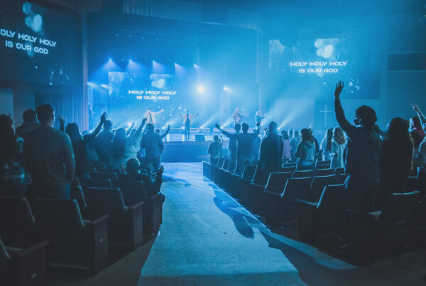
Churches have been projecting worship lyrics for well over a decade now, yet I’ve noticed that many have kept the same boring look that they started with years ago. Sure, plain text over a background gets the job done, but what if we got more creative?
Over the last few years, I’ve started seeing a few ministries moving to some more out-of-the-box methods for displaying the words to their songs. These looks make a huge impact on the look and feel of your corporate time of worship. The best part? They don’t require a lot of experience or time to make happen at your church. I achieved each of these looks right in ProPresenter.
Here are three looks that will take your worship lyrics to the next level:
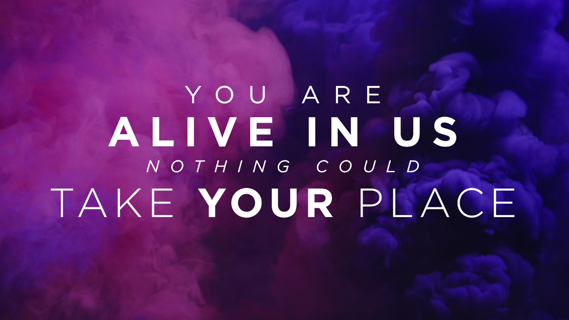
1. The “Boxed Text” Look
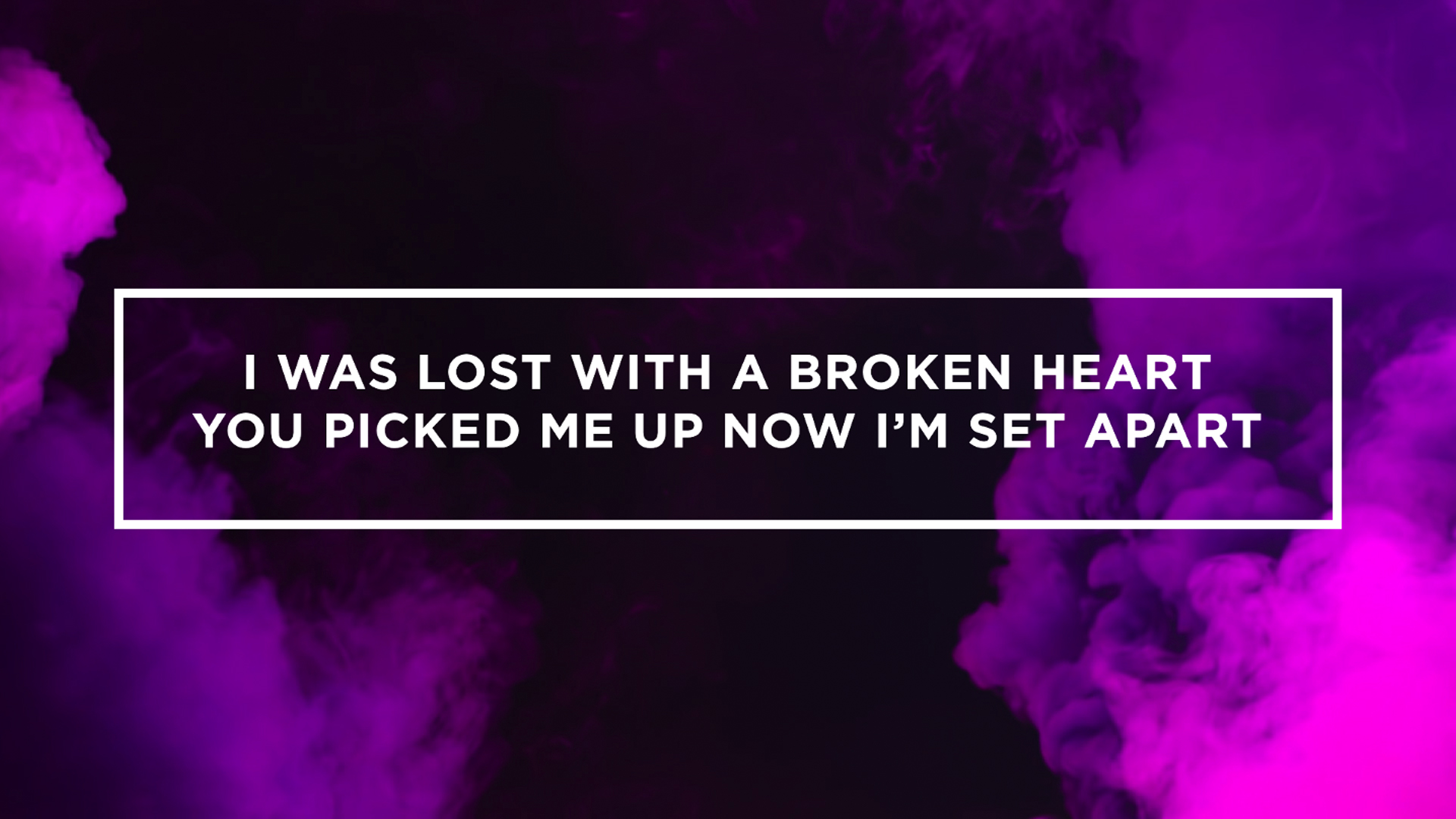
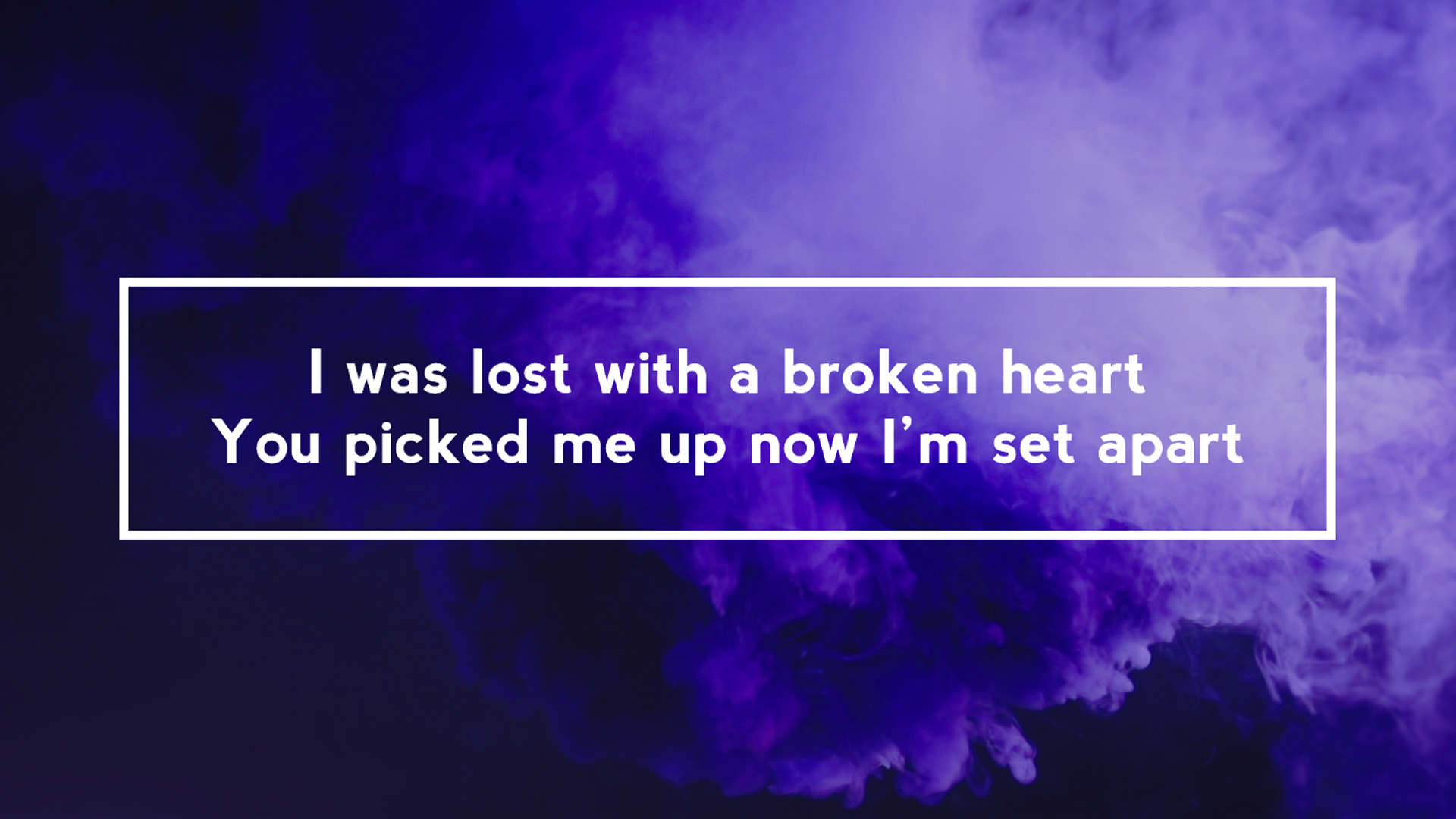
There are several ways to achieve this increasingly popular look. In my experience, the best long-term solution is to create a template in ProPresenter that includes an adjustable text box. You can download my template for this here.
Fonts Used In Examples: Gotham Bold, Nevis Bold
2. The “Emphasized Chorus” Look
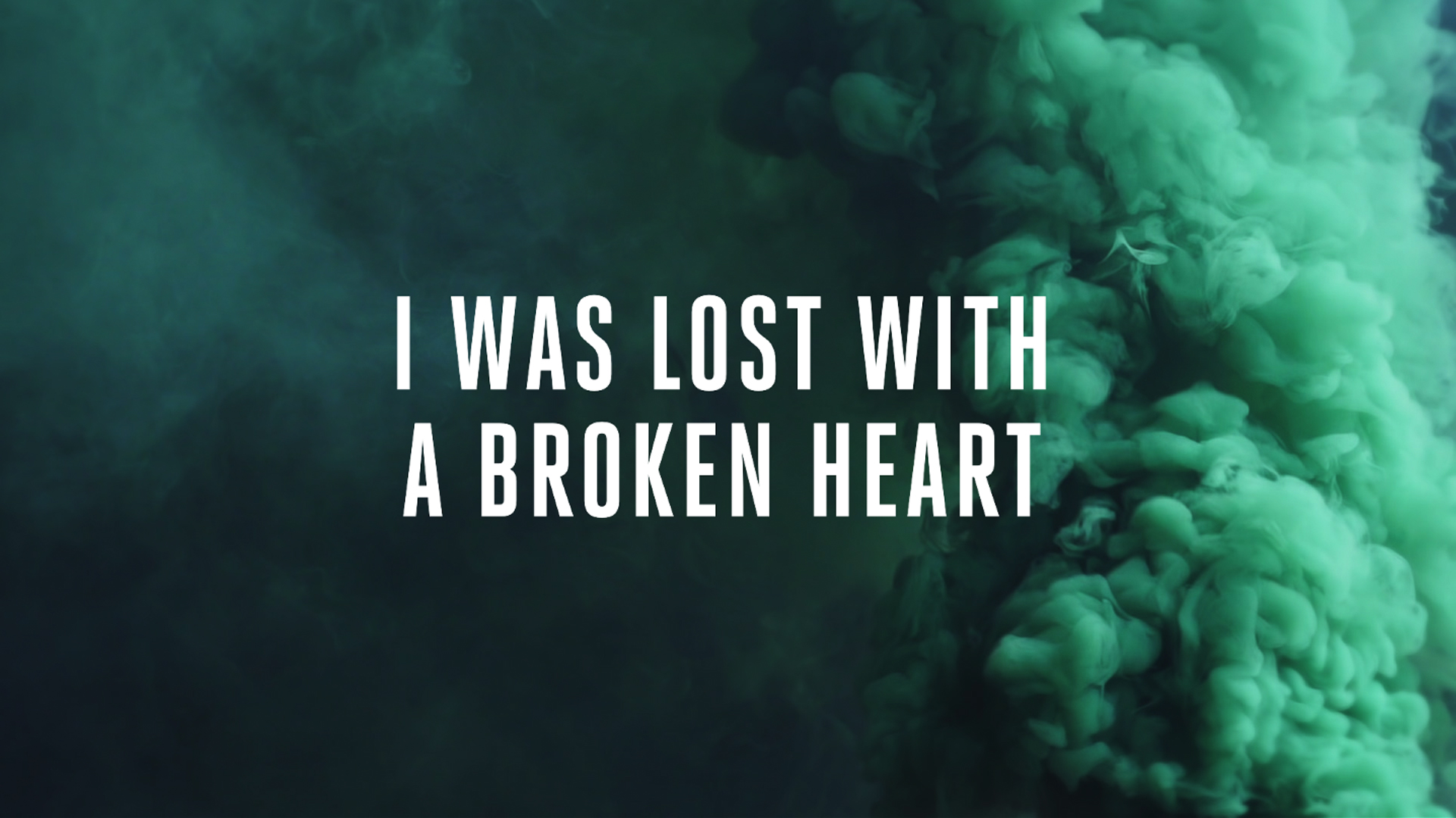
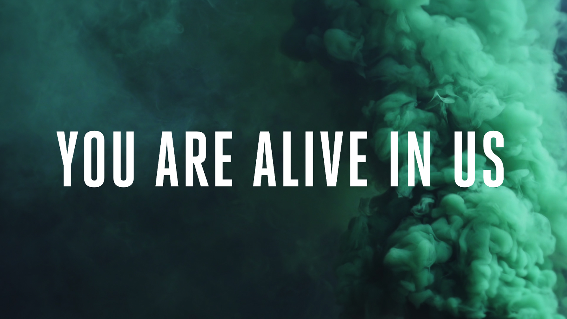
This look is achieved by simply displaying your verses in a normal, legible font size. Then, for your chorus, bridge, tag, or any other big moments in your song, increase the font to a larger size with less text on each slide. I’ve used this method a lot in my church and I’ve noticed that it actually helps the worship team deliver those powerful moments in songs.
Font Used In Examples: Heroic Condensed Bold
3. The “Instagram Quote” Look
This look that resembles many of the popular quotes that are all over Instagram is the most design-heavy of this list, but is still easy to achieve in just a few minutes. To keep it interesting, I chose a font family that included many alterations and adjusted the kerning for each line. When designing, remember to keep your slides simple and elegant. You don’t want to turn a good thing into a distraction.
Fonts Used In Examples: Gotham Light, Light Italic, Bold
What Do You Think?
Do you have any other next-level looks that you’d add to the list?
Let us know by leaving a comment below!
Backgrounds provided by Church Motion Graphics


Dude…I ALWAYS get excited when a new email from you comes out. I love all that you are creating and find your tips VERY helpful. Thanks for using your God-given gifts and abilities to help others find their potential and step outside the box a little bit. What you do is helping churches around the world reach lost people in fun and creative ways. Keep up the amazing work, my friend.
Thanks so much for the encouragement, Dustin! Keep doing what you’re doing for the Kingdom!
Thanks for including the template!
No problem! I foresaw the comments coming in. :)
Hi where do I get the template?
Thank you!!! I actually just had the boxed lyric idea ready to go for Easter! (I’m glad to know that it’s good!) I LOVE these ideas…thanks so much for sharing your creativity!!!
I think it’s a really good look that’s super easy to pull off. I’m a fan!
I’ve always been a fan of great design in the church. It’s important as we make series graphics and announcements to have a look and feel that is appealing to the eye and inviting to the community. HOWEVER, I believe we should move forward with incredible caution as we contemplate designing our slides too much. People perceive design to be something they should look at, and I wonder if we over-design our lyrics, will we inadvertently tell our community that this is something to look at and appreciate rather than something to engage with and use as a way to help you engage with your Heavenly Father?
I love hillsong and passion. However the box look they have implemented into their slide design is highly distracting and I believe it has begun a desire to “over-design” ostentatiousness our slides.
Our slides should not look like Instagram.
Would love to hear others thoughts.
YES! I agree! No… wait! I don’t! But I do! Well… kind of.
I agree that we have to be intentional about where we choose to direct people’s attention. Lighting can direct people’s eyes to the people on stage when it should be focused somewhere else. Slide design can attract people’s gaze when it should be focused elsewhere. In the same way, musical choices can give the impression that people should be listening (like it’s a concert) and not engaging and taking part in their worship. So… intentionality is the word. It’s not bad to focus people’s visual/auditory/olfactory senses somewhere. But why are we pointing them there?
I, however, disagree that “over-design” is distracting and ostentatious. Design speaks to intentionality. If we design our slides to draw attention to certain key words in the song, we are telling people this is important and maybe they are more likely to remember a line in a song during the week when they need to hear it. If Instagramming our slides can cue a visual memory that makes a believer (or non-believer) remember a moment in church even when they are thinking about they work/family/friends during the week, hopefully it can help them connect God to their everyday life.
These are my thoughts presented in my open had. Keep the discussion coming!
Great thoughts, Pat! Intentionality is key. Unless someone knows all of the words and chooses to close their eyes during worship, they will probably be looking at the screen. I like the idea of emphasizing certain words and showing their importance to the audience.
I read a similar thing recently about one perspective on the music aspect of worship. It was something along the lines of: if it looks like a concert and sounds like a concert, is that sending the message that it is, like a concert, something to be watched and observed, rather than something participated in and contributed to? It feels like a very similar argument to this. It’s a very nuanced subject, though, as different audiences respond to different things. For instance, in worship, if it’s not loud enough to cover up my voice, I won’t sing because I feel self conscience. I realize that’s also an issue with my own attitudes, and I “shouldn’t worry about what other people think and should only worry about what God thinks,” but it’s nonetheless a thing that prevents me from engaging if it’s too quiet. (Meanwhile I know plenty of older folks who can’t engage and will straight-up leave if it’s over like 92dB.) Visual design is very similar in that regard. Some people will be distracted by simplicity, others will be distracted by what they deem “too fancy,” etc. It’s very nuanced, and I think different churches can meet different needs in that regard. It’s impossible for one church to meet the aesthetic needs of all people; the point is that every church meets the spiritual needs of all people. If Jesus is there, he can meet people through silence, through darkness, through EDM-style praise, through kneeling & whispered prayers, through bread and wine or little mass-market cups & wafers… The goal is Jesus; the how is left, to a certain degree, up to individualization.
Yes. Totally agree with you Tyler. Form and function can and will differ. Just like denominational differences. We have to believe that God is bigger and more powerful than all of our man made distractions. If we don’t believe that, then what the heck are we all doing in the first place?? All of these disagreements about doing/not doing IMAG, concert style lighting, dB levels, etc. are the modern equivalent of long standing arguments such as sprinkle or submerge & KJV or NIV. I just wish as followers of Christ we could all encourage one another in what we do regardless of our opinions on how it is being done as long as the end goal is to grow the kingdom of God.
I hear you, Tom. Disagreements over style preferences can definitely be tiring. The best thing you can do is prayerfully choose what’s right in your setting.
Well said, Tyler. These looks aren’t for every church.
Luke, I’m glad you brought this up and started the conversation!
I’m sure you’ve had your fair share of conversations with people saying this about the motions you create. Really it could be said about any element of our worship services, right? It was said about motions. It was said about still backgrounds. It was said about electric instruments. It even goes back to musical instruments being used at all.
All of these things are experienced in one way or another in our gatherings. Even a plain font is experienced. If we spend so much of our time, energy, and creativity using these other mediums to lead our congregation closer to Jesus, why not apply the same intentionality here?
So to be clear…the first “out of the box” method is to literally out your lyrics in a box? ?
Seriously though, I’ve tried the box look and it never felt quite right so I abandoned that. I agree with Luke about the Instagram quote look. It definitely LOOKS great, but I think it would be more detrimental to worship than helpful.
I’m intrigued by the emphasized chorus look. I may give that one a try after Easter.
Haha! This is great, Taylor! I just knew somebody would see that about the boxes. :)
LOL…I totally didn’t even catch that when I typed it. Thanks for making me laugh, Taylor :)
I’ll agree for the most part with Luke’s assessment, and perhaps offer some practical reasons as well.
Sometimes I think we too easily conflate design with art (and I am guilty of this all the time), when they both have different reasons for being. Art is an end unto itself (aesthetically speaking), whereas design has the communication of ideas as its end. Naturally, this sort of communication is generally better accomplished with something visually appealing, but in the case of design the aesthetics are in service of the communication of the idea, and thus design is most successful when it is able to communicate that idea with clarity and without distraction.
As far as slide designs go, I don’t think there’s any clear cut thing to do or not to do, but since slides with text are meant to be read, legibility has to be of paramount importance; otherwise one potentially and unnecessarily excludes a large swath of people from engaging. The difficulty with lyric slides is that they have to be read in relatively fast succession, and this is usually combined with a wide array of familiarity with the text in question as well as a wide gamut of reading speeds and even proficiency in reading the language on the slide. Granted, the accompaniment of the music and sung words can aid in reading speed, but only if one is familiar with the music, which isn’t as statistically likely as those of us who are involved in it consistently week after week may think.
Given this reality, I would suggest erring on the side of simplicity and legibility whenever possible.
As far as that practically works out, I think the boxed effect is often fine, although it is a technique which is prone to overuse and which can easily cause distraction. From an aesthetic standpoint, a box generally has the effect of breaking up the flow of a design. There may be good reasons for doing this with any particular design, but the disruption of that flow can adversely affect the aesthetics. By the same token, a box around text serves a call-out of that text, but if the entirety of the lyrics are boxed, then the effect becomes less about emphasis and more about intentionally breaking the aesthetic flow or something else altogether.
From a legibility standpoint, I’d suggest not using all caps (or infrequently doing so), as many typefaces are quite difficult to read when there aren’t the visual cues that a distinction in the lower case letters provides. Some obviously work better than others, but the goal is legibility foremost and to have the aesthetics complement that.
I’d personally eschew the Instagram look for most lyrics, for many of the reasons enumerated. With Instagram you are able to engage the visual at your own pace, and thus the layout of text and various sizing, etc., can work well in that medium. But when you have to engage the same visual presentation without control over the pace, then the layout and readability become very important, and one risks excluding many from engaging because of this design choice, as aforementioned.
I like your points here, Jason. I understand your thinking behind your methods and respect it. For the past 11 years, I have been the biggest advocate for taking the safe route on these things. Seeing some of these new trends definitely turned me off at first. (If you think these are crazy, check out Young & Free’s lyric videos!) But, these new ideas have stretched and freed me up a bit to explore and be creative with our media. It’s been a very freeing change of pace that I’ve really enjoyed.
There is a plethora of comments here. And a variety of opinions on what is proper in worship. Let’s just talk about “distraction”. It’s become the church’s dirty word to eliminate something that for a personal preference to dislike an element in service. And it becomes mostly used by those in charge. And most of the time it’s such a personal preference I think the individual needs to grapple with their pet peeves vs letting go and worshiping God. With that said, God created us all unique, we all have different tastes, appeals, and turn offs. And I think with that God has given us many different styles of church’s. What works for one congregation won’t even be accepted by another. Your art, hard work, creativity, and service is both right and also extremely wrong. Art is subjective and because we put so much heart into our art it stings incredibly when we are told it’s a distraction and discarded without even a conversation. So my advice, if you are a church leader, Sr pastor, exec pastor who is of influence to make decisions, strategize with your creatives, ALL OF YOUR CREATIVES. .. get to know them, leverage their strength and leverage their hearts and really collaborate. You can stifle your own culture if all you want is the same thing for 20yrs or your can be forward thinking and be a culture that creates together. When a culture creates as a team, it’s supports the vision.
I first have to say I am not a creative. I am a friend of Luke’s who has often had many conversations about similar church topics.
I have always had a strong feeling about lyrics at church: black background, clean white font, not too many lines/words on a slide. I have never been a fan of motion backgrounds or busy still backgrounds for worship. For me, its too showy. Ya know…cus that’s a word. But I know there is real value in motion backgrounds, environmental projection in story telling. One of my favorites is still Long Hollow’s Creation Event https://vimeo.com/19198083
To echo what a few have said – its all about what works for the individual and individual church.
But here is my counter argument against any kind of still background with an image or motion background…in a worship setting….does it add anything? Does it bring you closer to the throne? I say the same about anything in worship services. My dad, who has led worship for over 30 years, will tell you the good worship band members know when not to play, which is just as important as knowing what to play. So if you take that and apply it to visuals, you have to now when to be creative and when not to be. Not being creative can be just as impactful, if not more (at times) than being creative. Do lyrics like “nothing but the blood of jesus” need a box, a cross-fading cross, a rolling hillside?
I don’t say all of this to be a curmudgeon. I’m only 33. I have been in/around many churches and feel like I have seen and heard it all. but I leave you with this thought-provoking question: “Why?”. Do you do it to show your skills, use the new apple product, show off of to your creative buddies, or is what you do on your slides a reflection of your desire to bring others closer to the throne. If that is your heart, then what anyone else says/thinks/observes doesn’t really matter.
I love that line: “Know when to be creative and when not to be.” Well said Bo (and your dad)!
Love it! Making changes to our Easter set ASAP!
As I said on the FB group thread, I feel that the bigger issue is that most people use these styles “just because” and “because it looks cool”. I personally do not see, particularly, what a box around lyrics does other than mimic many others who have done it before.
Is there intentionally behind it and does it fit the community it serves.
We’ve not upgraded to 6 just yet, any tip to get the boxed text template to work in 5?
Thanks Man, my team and I have done the first two, but did not no of the last one, we just had to add this to our Lyric editing this weekend. I love the font on the second lyric, is any free version of it available?
Keep it coming
great work as always creative pastor.
could the boxed text look be achieved in easyworship?
still haven’t found a real reason to switch to propresenter yet.. sorry
Hey, TJ. I don’t know that you can do this in Easy Worship. ProPresenter is a little more customizable. Let me know if you figure out a way!
I’m using pro presenter 5. You’re template will not work. Is there a version that will work?
Thanks!
Karl
Hey Karl. Try the ProPresenter 5 template –
http://www.thecreativepastor.com/wp-content/uploads/2016/04/TCP-Boxed-Text-Template.pro5_.zip
Awesome! Thanks Kendall!
Hey! Great tips, wanted to see if you had the template for ProPresenter 5.
Thanks for the great work and God Bless!
Hey Jan. Here’s a link to the ProPresenter 5 template –
http://www.thecreativepastor.com/wp-content/uploads/2016/04/TCP-Boxed-Text-Template.pro5_.zip
Great recommendations. I find I often use Unsplash, Pixabay, and Flickr’s creative commons.
How do you add the template to ProPresenter? It seems like you exported an empty song rather than an actual template file.
Hey guys…I am in need of some help with downloading the template to my Mac. I am not tech savvy so basically I go by trial and error with some help from YouTube from time to time. I downloaded the box text template and now have no idea how to get it up on propresenter 5. Any help would be greatly appreciated.
I love the idea of doing all the lyrics in all caps. But I worry that people will think we are “shouting” at them. What has been the feedback from churches doing this?
HI LORI
WE’VE JUST DONE IT… I WAS HESITANT AT FIRST FOR SIMILAR REASONS TO YOU BUT MAINLY BECAUSE OF HOW QUICK OUR TECH GUYS WOULD HAVE TO MOVE ON THE SLIDES… IT CERTAINLY REQUIREs A LOT MORE CONCENTRATION. (I’ll drop the all caps now, don’t want you to think I am shouting!!)
I’ve wanted to change to it for a while but knew it would be a big change for our worship team, and was cautious.
But I’ve seen it done so well in many churches here in the UK.
My reflections would be…
– It doesn’t give the appearance of shouting, as long as all your songs in a set are consistent it will just look normal after the first song.
– Concentration is key, anyone operating the words will have to move quicker on songs with less words on the screen, but if the song is ordered exactly as it will be sung then it’s just a case of clicking the arrow key through a song.
– Definitely use the rule of moving a slide on with 1/2 words left, people will already have processed the rest of the line by that point if their eyes are open.
-It can be time consuming to edit songs over to the all caps look, and with max of 2/3 lines per slide. This might just be my experience but we use a Proxima Nova condensed font, which means all the songs had to be added again, because in Pro Presenter there isn’t an option to put all lyrics in CAPS… unless I am missing something really obvious?? So this is done in Word and then copied into Pro Presenter as a new song. So that has been time consuming, but wouldn’t be if you used a font like Bebas Neue which is all caps anyway.
But all in all, it has been a great switch for us and although cautious to begin with, it looks great!
The feedback from our community has been mostly good, and particularly from the older members who I thought would have been the first to be against it.
Hope that helps in someway, and if anyone can tell me of a quicker way in Pro Presenter to switch songs to all caps that would be great!!
ps. love this website and all the creative tips it equips the church with. Thank you Kendall!
Thank you for the template. I haven’t used templates yet. As long as I have been using ProPresenter, I feel like I’m still such a newbie.
I can’t seem to get tired of using the “boxed” style on my lyric slide. I just love them but I guess I have step up my game and find some new fresh ideas. This article is a good start. Thanks .
I’m a fan of the box! :)
Kendall, can you walk me through on how to get the template into propresenter 5 for my Mac? Thanks
Is the template available for PP5?
Hey Daniel. Here’s a link to the ProPresenter 5 template –
http://www.thecreativepastor.com/wp-content/uploads/2016/04/TCP-Boxed-Text-Template.pro5_.zip
Hey Erik. Here’s a link to the ProPresenter 5 template –
http://www.thecreativepastor.com/wp-content/uploads/2016/04/TCP-Boxed-Text-Template.pro5_.zip
Hillsong’s 2014 songs (if I’m not mistaken, used box type on their video lyrics.
Love the ideas! Since seeing this, we’ve began implementing idea number one on Sundays. Followup question: any thoughts on how to achieve this look? I think it would be a cool alternative option to #1, it appears to be transparent text and a solid white text box per line of text.
http://www.nextlevelchurch.net/wp-content/uploads/2016/04/Screen-Shot-2016-04-11-at-10.15.54-AM.png
That photo is from Centerpoint! A good friend of mine is their creative pastor. I’ll see if I can get him to chime in here. I believe he creates those in Photoshop.
Thanks, Kendall! Josh’s response was exactly what I needed to know. Thanks!
PS- I love your site, man. Keep up the great work- I’m staying tuned in!
Hey man.
I’d be happy to help. This is actually our church :-)
We moved away from this book last year, but we loved it. We created these lyrics in Photoshop as PNG files.
You have two layers, the first layer being your text. The 2nd, below it is your white box.
The link below will help you understand how to knock out the text from the box in Photoshop. Once you do that you just export the file as a PNG file.
Hope this helps!
https://helpx.adobe.com/photoshop/using/knockout-reveal-content-layers.html
Yes- that’s perfect! Thanks for the feedback, Josh. You rock.
Tell Wes hello for me and keep rockin’ it at Centerpoint!
Love these looks! Gotham has been my go to font for a couple years now.
Another great look that I’ve been using at City Church in Tulsa for almost over a year now is Hand Drawn lyrics. I’ve hand written over 50 songs now so I decided to put together a free course on how to easily do this yourself. (It also includes a download link to all those songs to get you started) Feel free to share if you think it would be helpful to the community.
http://jensencreative.teachable.com/courses/hand-drawn-lyrics
Awesome, Cody!
Is there a template for Media Shout 6?
Sorry, I haven’t worked in Media Shout in a long time. We’re looking to add Worship Extreme templates soon.
Love the Heroic Condensed Bold font used in the second example…any way to get it free somewhere online? Don’t know if I’d be willing to shell out $240 for the font family or even $30 for the one font. Great stuff man!
No, but use can emphasize your chorus with a free font. :)
Thank you so much for the work you are doing to help encourage great design in our worship services.
Question for you. I assume you are using pro presenter when creating your slides. How do you suggest creating a template for a slide that has various text fonts and sizes, such as in your #3 example “Instagram Quote”? Is there any way to maintain the data of alike a “bolded” font, so if i were to switch to a different font, it would remember it?
I hope that makes sense.
There isn’t a great way to do this. #3 is pretty custom and your idea might would require a custom-made font. It would be a lot of work either way. Like a said, it’s pretty custom. Maybe reserve this for special occasions.
Great, really open examples. thank you Kendall!
Hey, Kendall, thanks for these ideas! “Kerning” should be “tracking” above. Kerning is a spacing adjustment between two adjacent characters to improve their fit (like “AV”), whereas tracking is a spacing adjustment between all the characters in a range of text. Mentioning this to help folks find the right setting in their software.
I’m a bit late to the party. How do you create a different font for different sections or words? I thought you were locked in to what the overall template setting was?