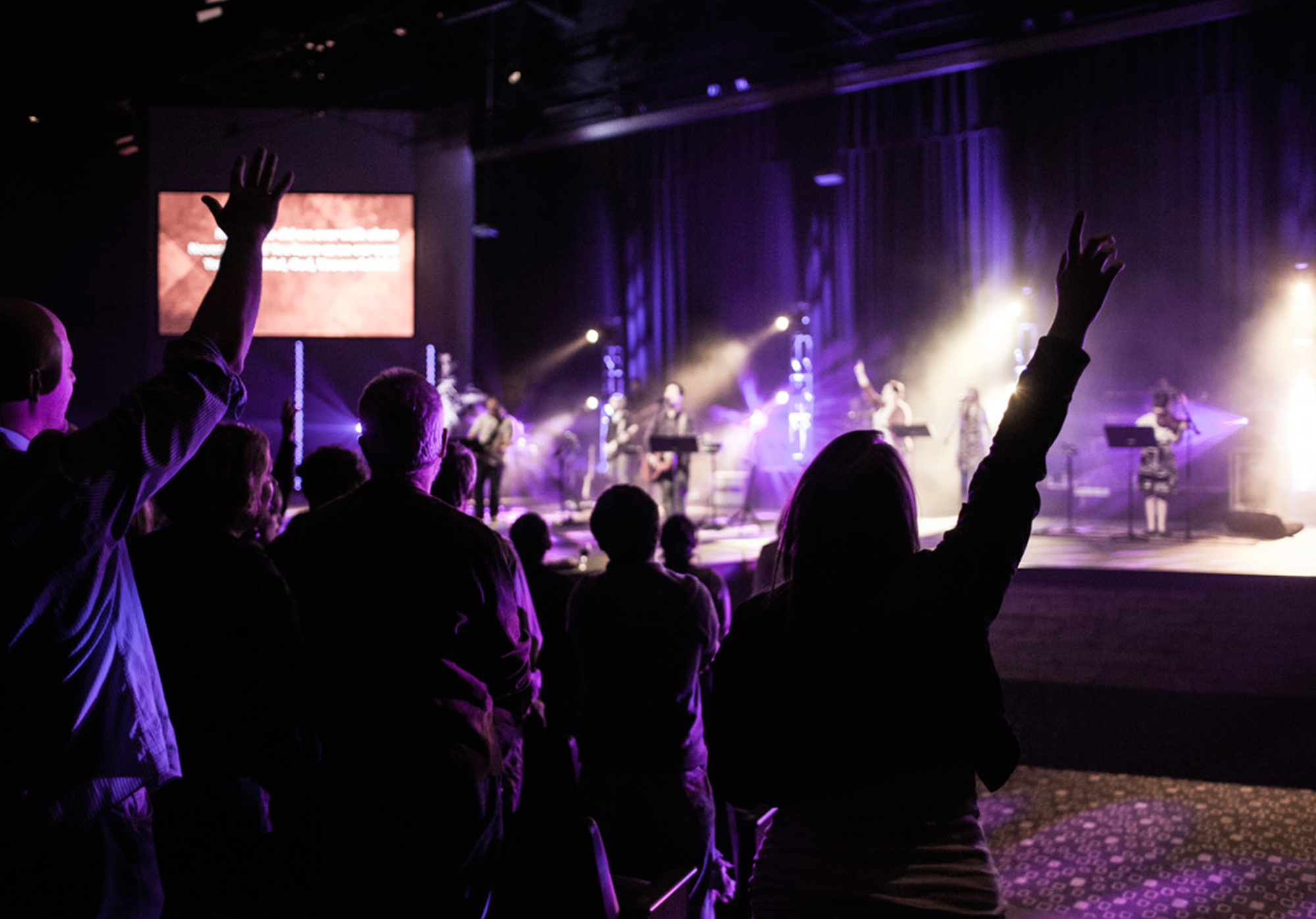
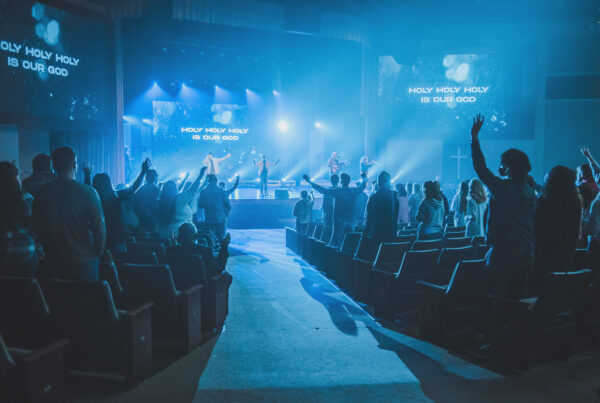
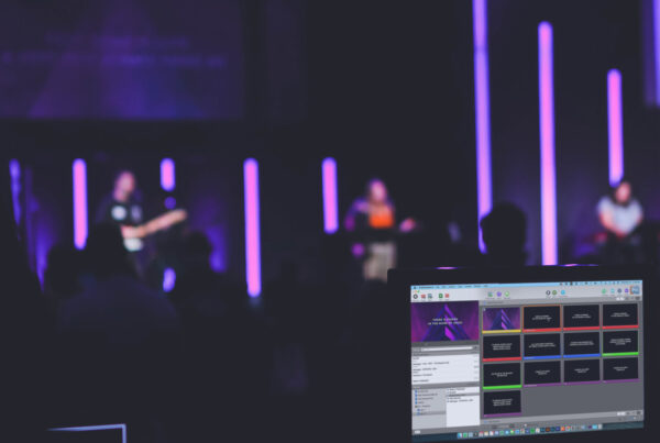
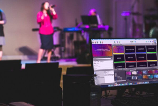
We’ve become pretty passionate in our church about displaying the lyrics to our praise & worship songs. The way we see it, anytime that someone who is new to church comes into one of your services, chances are, they’ve probably never heard the songs you’re singing. You can imagine how uncomfortable it can be not knowing the words to a song that everyone around you is singing. Because of this, we’ve learned that having the lyrics available through projectors and screens goes a long, long way.
However, I cannot help but to believe that a certain responsibility comes with having control of what your entire congregation will be watching in their time of worship. Simply put, the more aesthetically pleasing the slide, the less it distracts and the more it enhances their experience. In addition, by using background images alongside your lyrics, you can create a wonderful atmosphere that directs peoples’ attention towards Christ. Below are just a few suggestions on how to take your lyrics slides to the next level.
1. Text Sizing Makes All The Difference
Avoid using large font sizes that fill the entire screen. It communicates a “scream” to your congregation and can be a tad bit overwhelming. Instead, use the smallest size possible, while not excluding those in the back of the room. The more of the background that can be seen, the better—they can create an incredible atmosphere.

2. Make The Most of Imagery
A personal pet peeve of mine is seeing lyric slides that have great imagery such as crosses or worshippers, yet they are covered by words! This often comes from simply choosing a background and using the default center placement of lyrics. However, by simply choosing a less invasive location for your words, you can actually complement your image.


3. Adjust Text Color As Needed
While they are definitely in the minority, there are some great backgrounds to be found out there that are light in color. But, the standard white text that most media teams are accustomed to using on all of their slides just won’t do the trick for these. Instead, don’t be afraid to experiment with darker colors that compliment the color of your background or just a plain black. Regardless, it’s important to use a color that is going to be visible on these lighter canvases.

Other Helpful Tips
• Shadow: As you can see in most of these slides, I’ve used a shadow on our lyrics to increase the visibility of the text. This is a great feature that can be found in pretty much any presentation software. However, it is not the end all-cure all for making your text show up better. It can sometimes even make it MORE difficult to see. However, when used right, you increase the number of backgrounds you’re able to us because it increases the readability of your lyrics.
• Color: Using different colored backgrounds at different times throughout your service can be a great way to convey different moods and messages. Colors such as blue suggest peace and serenity, while colors like yellow and orange increase energy. Just remember to use color responsibly as to not be a distraction.
• Speed: One of the most distracting uses of backgrounds can be a fast paced motion during a slower worship song. Try your best to match the speed of the background to the tempo of the song. This can really add to the excitement of a fast song and make the slower songs that much more intimate.
Sources:
A Guidebook For Visual Worship by Steven Proctor
The Art of Curating Worship by Mark Pierson
Would You Put Ketchup On Your Steak? by Barton Damer


Which font have you used for this example? And how did you do the shadow? I am a newbe with Propresenter 5 and would like to set my default like this!
Hey there, Winston. This is “Helvetica Neue Condensed Bold” and here are the shadow settings –
Angle: 135
Length: 5.0
Radius: 10.0
Hope that helps! Remember, the easiest way to get all of your songs to have this look is to create a template. Let me know if you have anymore questions!
I subscribe to several different background sites but they are all starting to look the same to me. Can you share what sites you pull your backgrounds from? You’ve shown 2 here that I haven’t seen before.
Thanks,
K
I’ve noticed this problem, too. The most original motions seem to be coming from Church Motion Graphics right now. Hope that helps!
Thanks for the great tips!! I’m starting to get involved in the media at our church. As per all your resources that you pointed to, I decided to go with creationswap. It was a monthly fee for premium and I love there are several items I like and have used. I also see you mentioned centerlinemedia. I personally am paying for the creationswap, but now if I like something from centerlinemedia I will have to pay more. I’m not complaining, but was wondering if this is also what you do or does your church have a nice budget for all the various media sites?
Also… after seeing one of your comments mentioning motionworship, I decided to give it a try too. So two subscriptions should be more than enough. Plus all the free resources for images you’ve mentioned in other blogs. Thanks again!!