
Designing graphic packs for sermon series is one of my favorite parts of creative ministry. I love being able to create a visual representation of what the pastor will be communicating in that season of the church. These graphics are not only used during the actual message on Sundays, but also during the week to promote these messages. Because there are so many elements needed for each series, I created this checklist for myself that I use whenever I sit down to design a new pack.
Creating all of your graphics for a series in advance saves you time by keeping you from having to revisit your Photoshop file later. For example, when you need to post a quick promo on your Facebook page, having that image ready in advance allows you to knock out your social post in no time.
Every church is different, so your checklist may look different than mine. My hope is that this can serve as a basic guideline for creating a list of your own.
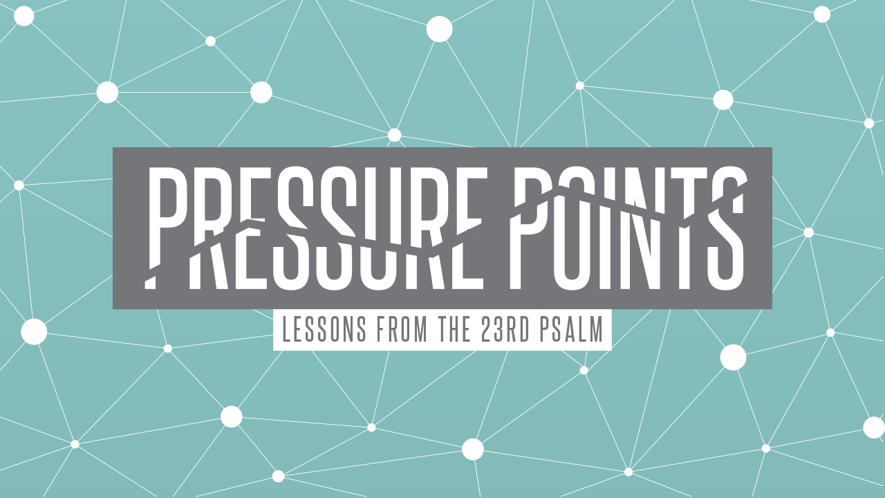
1. Main Title Slide
Used on screens during sermon, on website, and in email blasts (1920×1080)
2. Background Slides
Used on screens during sermon to show points, scripture, and quotes (1920×1080)


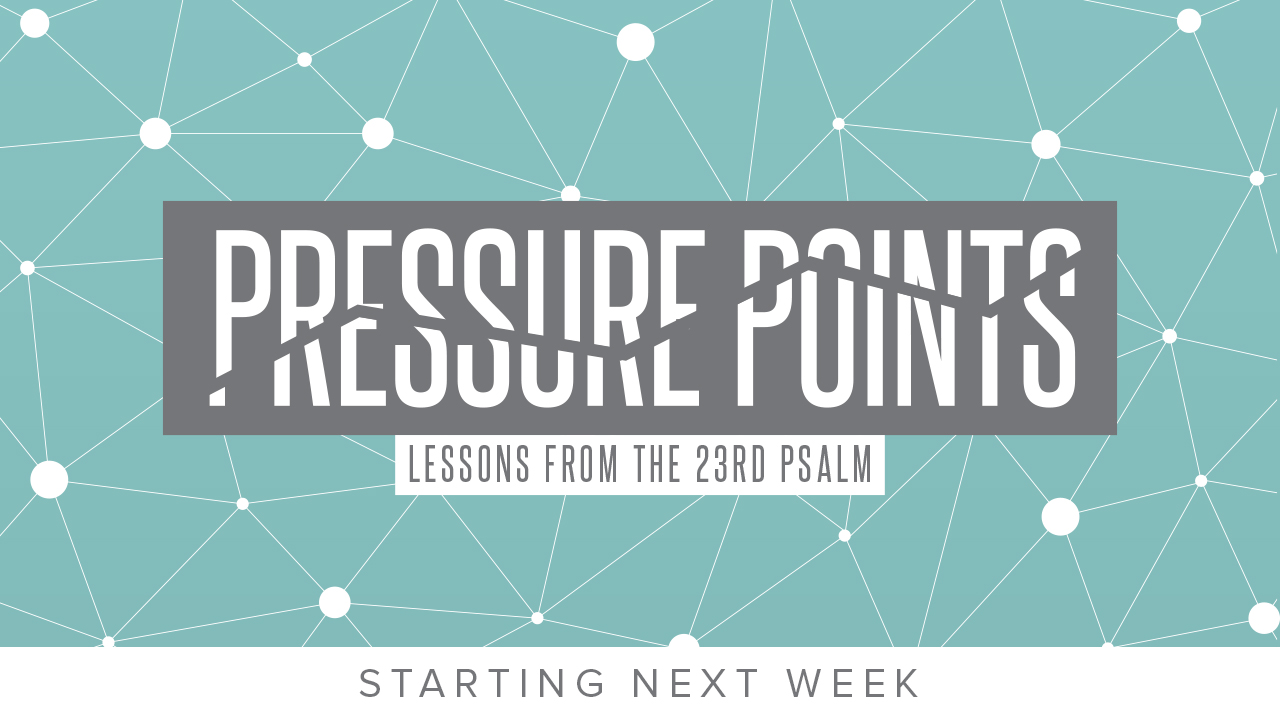
3. Announcement Slides
Used on screens leading up to sermon, on website, and in email blasts (1920×1080)
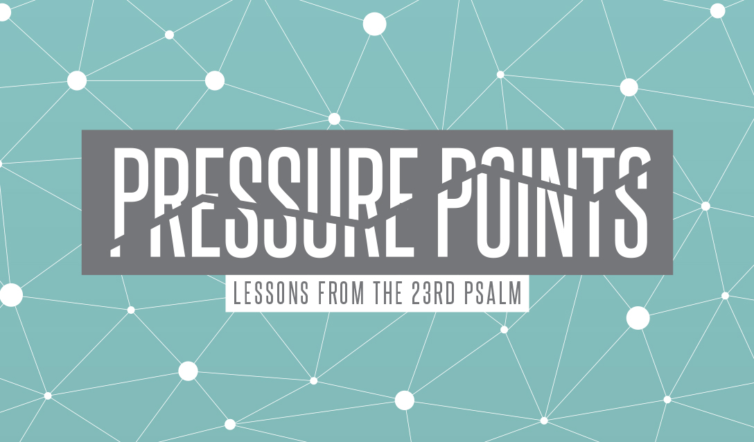
4. Invite Card
Distributed to congregation one week before and during series (2″ x 3.5″ business card)
5. Facebook Cover
Used on church Facebook page one week before and during series (851×315)

6. Twitter Header
Used on church Twitter page one week before and during series (1500×500)

7. Social Images and Blanks
Used on Facebook/Twitter/Instagram for promotion and sermon quotes (1200×1200)

8. Website Slider Image
Used on church website one week before and during series (Size varies from site to site)

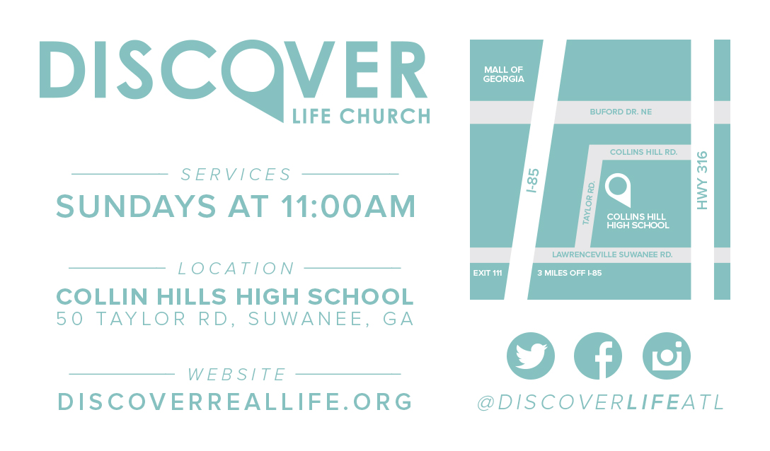
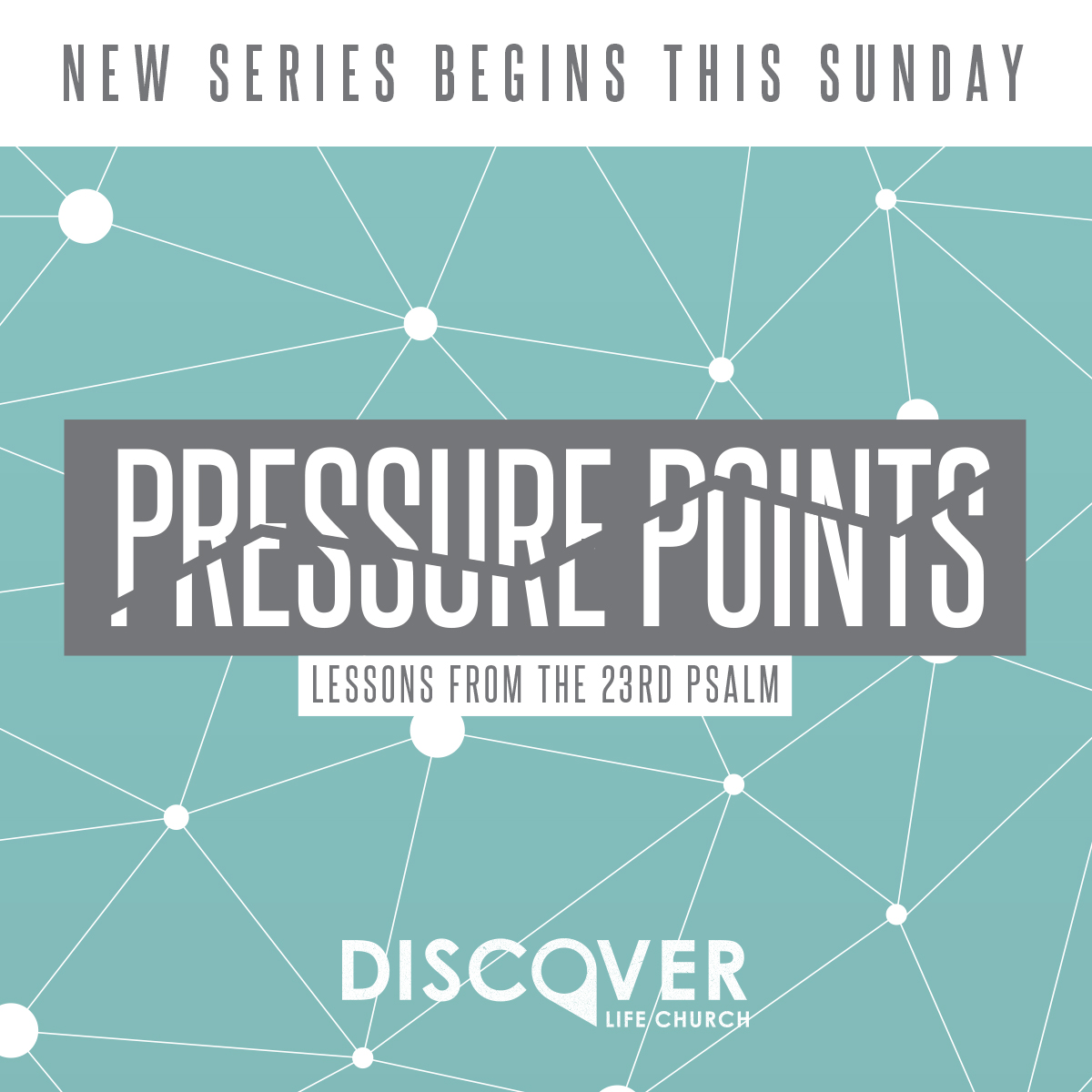
The examples shown above are from a series pack that I designed for Discover Life Church. They have generously offered downloads of this design (including Photoshop files) here.
Font used: Steelfish
Do you have a checklist that you use when designing series graphics?
Let us know by leaving a comment below!


This is great! Last year I realized I needed a checklist like this which includes a few different extras depending on what ministry it is. It seems tedious when designing but it really does help in the long run when you’ve got a complete package of files ready to go at the onset of promotion.
My experience is this: going a step further and creating different text options (longer range – e.g. “March 5”, plus short range dates such as “next week”, or “tomorrow”) is something I find helpful for the promotion process too. Knock it all out at once. :)
Lastly, one tip: making templates of your screen/social media sizes in Photoshop is the way to go. In Illustrator, using the Artboard tool and Layers is super helpful. I start designing for the largest size then I can create a new file based on the template I need such as Instagram, and just copy the layers over and scale away. Perhaps there are other ways of doing this efficiently?
Debbie, this is all great stuff! :)
I have a set of preset InDesign templates, and after having created the visuals in PhotoShop (usually), I go ahead and just readapt the contents of the visuals to fit our various needs: Facebook pic, Twitter pic (@CVVParis), The City promo, ppt background for the title slide and then one for the other slides, and a square visual for our Mixcloud podcast which then appears in the sermons page of the website. I usually export the logo separately in png format so that it can be used as a slider within the slider on our website.
Love the idea of printing stuff off to give to friends/neighbours/colleagues before it kicks off.
Very cool, Nathan!
Enjoyed the read!
I also modify the church logo in order to compliment the style of the current series. I also created a checklist of places where I need to change all of the graphics. Otherwise, I tend to forget to change one or two of them over.
Good call, Zach! I like that.
I think the only thing I might add is Instagram. Other than that your list is my list.
Thanks Kendall.
For putting scriptures in to the slides for use during a message is that done on the Pro Presenter side with the blank backdrops or are the scriptures/key points/quotes also added in to the images?
At the moment our workflow includes adding all the text for the sermon in to Photoshop, because I find the result is of a higher quality than trying to do it through Pro Presenter.
Hey, Bevan – After I create these graphics in Photoshop, I create my slides in Keynote each week. (I’ll export them as jpegs and bring them into ProPresenter.)
What do you find the benefit to adding the text in Keynote to be?
This is very helpful!
@Kendal, would you (or anyone) be willing to share their CS templates for all these?
Hey, Yamil! The link is at the bottom of the post. :)
My bad, Didn’t see that. Thanks man!
As someone who does most of the graphic design for our church, this is cool to see. I have a similar checklist, and seeing this makes me feel like I’m creating processes that work. One thing I’ve learned is, when creating graphics that are going to be compressed or displayed on “Retina” screens, I always double the size of the graphic. For instance, a Facebook cover photo’s recommended size is 851×315, and since Facebook compresses the image while uploading it(therefore making it kind of pixelated), I design it at 1702×630. That helps is look more crisp and sharp and since its technically the same aspect ratio (just double the pixels). The same goes for Instagram. I have an iPhone 6s Plus and the screen is 1080 pixels wide, so I just design all of our social images and blanks at 2160×2160. Makes for super high quality looking graphics.
Fantastic tip Ryan! I have had that not-so-crisp result and couldn’t figure it out. Double the size = high quality!
Blessings
Our graphics team set up an Illustrator template file that has 11 or 12 artboards, each sized for a different medium. Many of the artboards include a note to the side of it on the pasteboard, indicating final format (e.g. “save as png” or “jpg; keep type away from trim”). Because we have several people work on graphics, this minimizes guesswork.
We use it not only for sermon series graphics but for all our ministry events that are slated to receive medium or high emphasis. As soon as the main graphic is approved, the designer creates all the variations as a graphic package. Takes less than 30 minutes up front, and saves a ton of time later!
By having only one Illustrator graphic file for each event or sermon series, it also minimizes the risk of using the wrong file in the future if an update is needed.
This is great! Thanks for sharing! :)
Trying to set up a policy/procedure for our team. We have one graphics person, but 3 of us that work on the team. However, we all do different things not just creative. How do you set priority for different jobs? Do you have an ABCD list for high, medium, low emphasis? Any help would be appreciated!
Super helpful to see it all laid out! Thanks
Any advice on quick ways to do slides when you only get the sermon titles with a very limited time to complete? For example the very next day. I usually just use the standard font and find pictures or graphics to use as illustrations for the sermon.
Hey Mike, check out this article that I wrote on that subject – http://www.thecreativepastor.com/great-sermon-slides-on-the-fly/
Do you try to coordinate the sermon slides with the worship slides (in terms of color, texture, font, etc.)?
That’s a great questions. I try my best to get them to match in color, texture, and overall style. It’s not always easy, though.
I am a newbie, starting to work with a church (as a volunteer) in the area of projection and have a question, based on what I have seen and experienced so far. My question is: What are the best ways to communicate “go to the next sermon slide” when the projector operator is just that – an operator who was not in on the flow of the sermon or the creation of the sermon supporting slides? Currently it is the staff person who creates the slides who runs the projector. I want to help the church train and utilize volunteers, but I have no really good ideas on how the person in the booth will know that “now is the time to hit the space bar.” I’d appreciate any ideas you would care to share with me. Thanks, Pete Blair
I trained my team members running ProPresenter to display a slide when he is saying it from stage. If he never says it, they don’t display it. It also can be helpful to have a printout of his sermon notes.
Great list! We also generate a 300 px square image for our worship team to use in its online planning center.
I love the graphics! Do you have any resources of maybe a sermon outline for this series? I am looking for sermon notes about pressure points.
I am not able to download from the link. It states it has been deleted. Can you assist?