
Fonts are a necessary component of nearly every area of creative ministry. Whether it’s sermon graphics, worship lyrics, printed material, or images for the web, you’ll have to choose a typeface for your designs.
I’ve shared several articles with resources for great fonts (links below), but I thought it would go a long way to emphasize ones to avoid, as well.
Not all of these fonts are inherently awful, or even ugly, as much as they have just been overused. When a design element is seen everywhere for years and years, it becomes associated with the kind of places it’s been used. You don’t want your audience imagining garage sales, kid’s birthday parties, or office memos when they see your design.
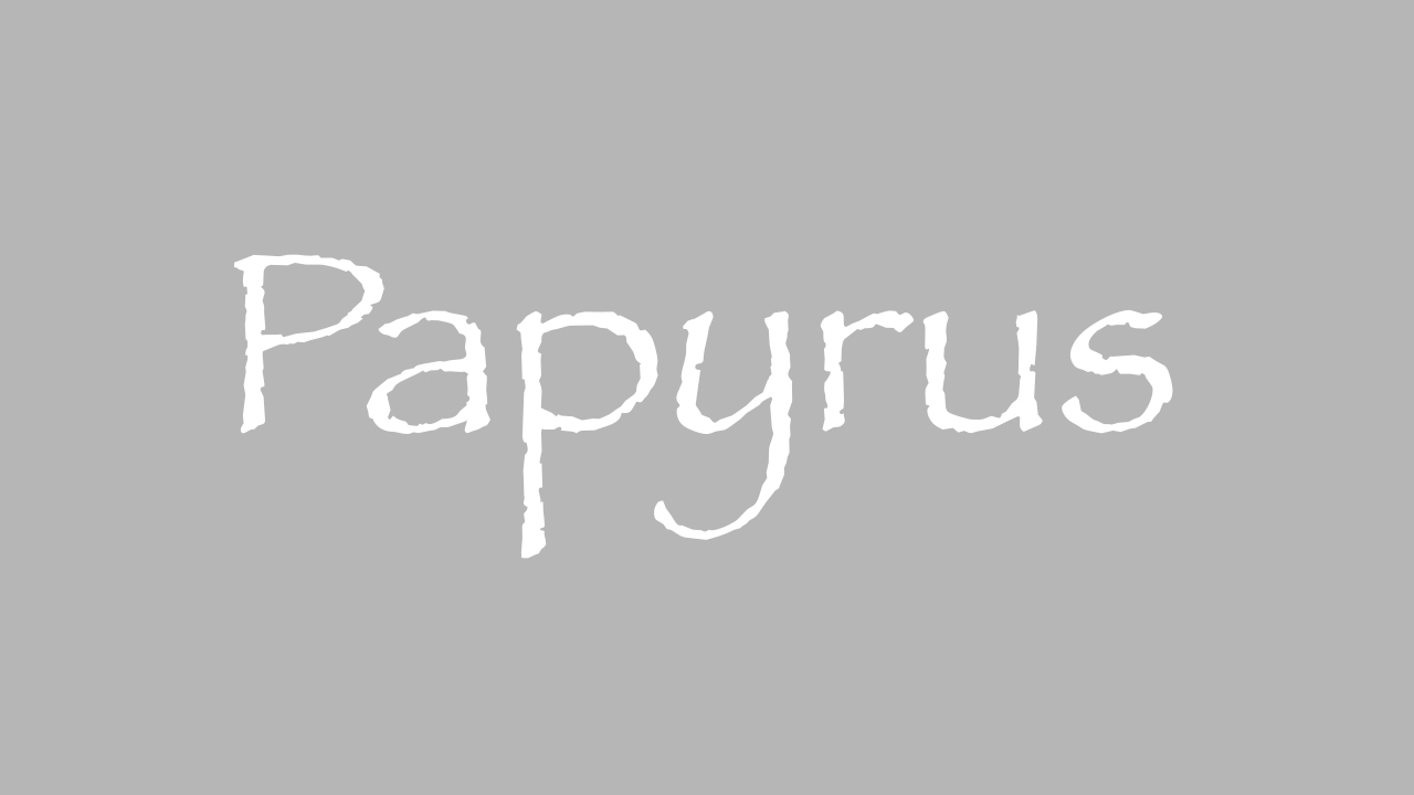
1. Papyrus
If you’ve spent twenty minutes on a computer, you’ve probably used this font before. Papyrus is one of the few creative fonts that comes preloaded, so naturally it’s an easy go-to for beginners who need something cooler than Times New Roman. The problem is that people have been doing this for more than twenty years. It has been used everywhere…including places it didn’t belong. Since it has now become synonymous with amateur design, it’s probably best to avoid altogether.
2. Comic Sans
People love to hate this font. In the design community, you could be having a conversation about nearly any font and someone will casually bring up Comic Sans being awful. Like Papyrus, this font has been used and misused in so many places that it’s now notoriously amateur. It comes off as tacky and childish. Avoid it at all costs. Even in kid’s ministry, I’d recommend finding other fonts that don’t have such a bad rep.

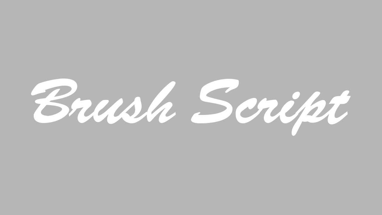
3. Brush Script
You may be starting to recognize a pattern here. If it comes stock on your computer, you should probably question it. Brush Script was designed in the early 1940’s and has come preloaded on computers since I can remember. It has been an easy choice for script fonts for non-designers and therefore has been considered exhausted for some time. With so many brush fonts now available at low costs, there are plenty of alternatives to use instead.
4. Impact
The name says it all, right? You want your designs to make an impact, so this must be the perfect font! It’s true, this font can be super easy to read and great for grabbing the attention of readers. However, it has now been so overused that it’s left unable to make an impact at all. Also, most designers agree that this font is too thin and amateurish to stand out. Avoid it and opt for an alternative font choice.

Where Can I Find Good Fonts?
I couldn’t leave you hanging with only bad news. Here are some resources where you can find some quality fonts that will make your project look great!
• CMG Sans: The World’s Best Worship Lyric Font
• Twenty Must-Have Fonts You Can Download For Free
• Six Surprisingly Great Fonts To Use For Worship Lyrics
• Five Websites For Quality Free Fonts
What Do You Think?
Have you used any of these fonts in your designs?
Let us know by leaving a comment below!


I learned from Brady Shearer not to use Papyrus and Comic Sans, so I avoid them like the plague! I’ve never used the other two, and now I know I never will! :)
Thank you for the awesome resources, Kendall!
Brady is the man! He has lots of font resources on ProChurchTools.com that I’d recommend to anyone.
Helvetica, Arial, and Tahoma Bold are all very overused on lyric slides. My thing is that some people put backgrounds behind these and you cannot see the words. I have been to churches like that and you can’t read the lyrics.
I’ve moved away from standard fonts like these for our lyrics to fonts like Gotham for an easy to read sans, or brushed fonts that match my series graphic.
i like Helvetica Neue Medium in all caps. thats what we use for lyrics. im open to different fonts though.
Mistral is a no-go font too. I usually like the fonts that Creative Market offers every week in their “free goods” section, and for a lot of stuff, I use Open Sans or Segoe UI for their million different weights. :D
Mistral is the worst! :P
I love the freebies from Creative Market, as well.
Mistral! You guys are going way back. I still see Cooper Black used from time to time, and copperplate is getting pretty dated too.
And nobody ever needs to use Curlz!
Helvetica Neue is not bad, in the extended face, I like Akzidenz Grotesk for a strong sans font.
Oh, and the one issue I will take with you is in the first paragraph you state that, “Not all of these fonts are inherently awful, or even ugly, as much as they have just been overused.”
Comic Sans is an ugly font. It has no balance or rhythm, I really don’t know why it gets used so much.
Good article.
Comic sans got a reputation for being “easy to read” although there is no evidence to back it up, so I guess that might help.
Here in the Philippines, Algerian is the most common font that has been used for over a decade hehe.
I thought this article was good but since I’m new to all this can you make some alternative suggestions? We would be using them for lyrics and online/email ads.
Thank you!
Check out the links at the bottom of the article. :)
Nice! Papyrus and Comic Sans were definitely on my list … as was the dreaded Curlz. *shudder*
Added a link to your post from mine here: http://www.mediashout.com/blog/basic-typography-tips/
Thanks for writing this!
Put Scriptina on that list…that font makes me puke every time I see it on church media…yowie!
I didn’t realize peeps still used these! ?
Unfortunately so…
I like verdana. There was a survey I read once that said that displayed text was easiest to read in this typeface (aka misnamed many places as”font”). Someone mentioned using ALL CAPS NO NO NO. Tis very tiring to read.